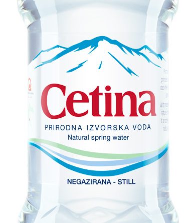
Cetina: a gift from Nature, simply bottled
The Croatian company Naturalis aimed to strengthen the reputation of its brand, Cetina, by focusing not just on the strong connection with the place where its water flows but also on its purity and its perfect composition. PET Engineering was asked to create a new brand identity and a packaging design able to differentiate Cetina from the existing water brands highlighting the core authentic properties of the product and defining the visual aspect for a coherent online & offline brand communication.
The new visual identity gives a contemporary twist to Cetina’s brand equity elements thanks to a more modern and thinner font and to the simplification of the symbols that previously stood for the green fields, the lake and the water source, now symbolised by simple and smooth lines.
The importance of the mountain Dinara, where the journey of Cetina water begins, is clearly communicated through the stylised mountains on the label and the two embossments on the bottle; the purity, achieved thanks to a century running in the dark among limestone rocks, is conveyed by the pure white background. The packaging, available in 0.5l, 1.0l and 1.5l formats for still and sparkling water, is sleek and minimal, because Cetina doesn’t need any superstructure to communicate itself, as it has already received the best from Nature.

