Clariant targets Asia with satin effect for high-end personal care packaging
Clariant colour specialists have combined three colours from the ColorForward 2021 trend palette with a satin brushed-glass special effect in order to appeal to consumers in the booming Asian personal care market. The resulting look helps PET packaging give the impression of luxury and prestige otherwise associated with the brushed glass used for high-end branded products.
The technology behind the satin effect, itself, is not new. In fact, Clariant was one of the first companies to bring it to the market almost 15 years ago. “What is new,” explains Vick Cai, Designer at Clariant ColorWorks Asia-Pacific, “is the fact that we are using it in combination with ColorForward trend colours intentionally to target a very specific audience. In this project, we focused on colours for the Asian personal care market, but we could do the same thing for any category in any region. It’s the kind of thing we do every day at Clariant ColorWorks.”
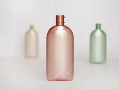
While the satin effect can be used with any colour – or no colour at all – the team at Clariant ColorWorks design and technology centers in Italy and Singapore decided to focus on colours that are most likely to appeal to their target audience. They settled on three colours introduced in ColorForward 2021, the 16th edition of Clariant’s annual colour forecasting guide for the plastics industry:
- The golden ticket is a translucent beige with subtle gold flecks that create a feeling of luxury and indulgence.
- No WI-FI is a soft green that suggests healthy, natural products, which don’t contain preservatives and which are less likely to cause skin irritation.
- Motus intelligentia is a warm pinkish coral. In Asian culture, warm colours like this are associated with youthfulness and the fight against aging.
“We did a lot of research into the Asian skin care market, especially in Japan and Korea, where many of the most popular brands come from,” Vick Cai continues. “What we found is that there is a definite preference for soft, muted colours and those that are found in nature. So we chose beige and a light green, and even the red we selected is a very natural shade. Then, by adding the satin look, we create an illusion of depth within the container walls, making the bottle appear more like glass. However, the effect is not only visual. It gives the bottle a softer surface feel. It makes it more pleasurable to hold in your hand and this further heightens the impression of luxury.”
The effect is developed during the PET stretch blow-moulding process. A proprietary additive, in concentrated masterbatch form, is added to natural PET resin during the moulding of the bottle preform. Then, as the preform is reheated, stretched and blown into the finished shape, the satin look emerges.